Wednesday 8 February 2017

3b) Research and Explain how and why a suite of idents might be designed, prepare a case studyon a particular channel’s current suite of television idents – at least 4. The BBC or BBC 3, Viva, MTV Classic or Sumo examples would work well.

Choose a different suite of idents each 

          i.  What the theme of the suite is
         ii.  How/why the theme appeals to the viewers (e.g. creating a particular tone to target a particular audience type)
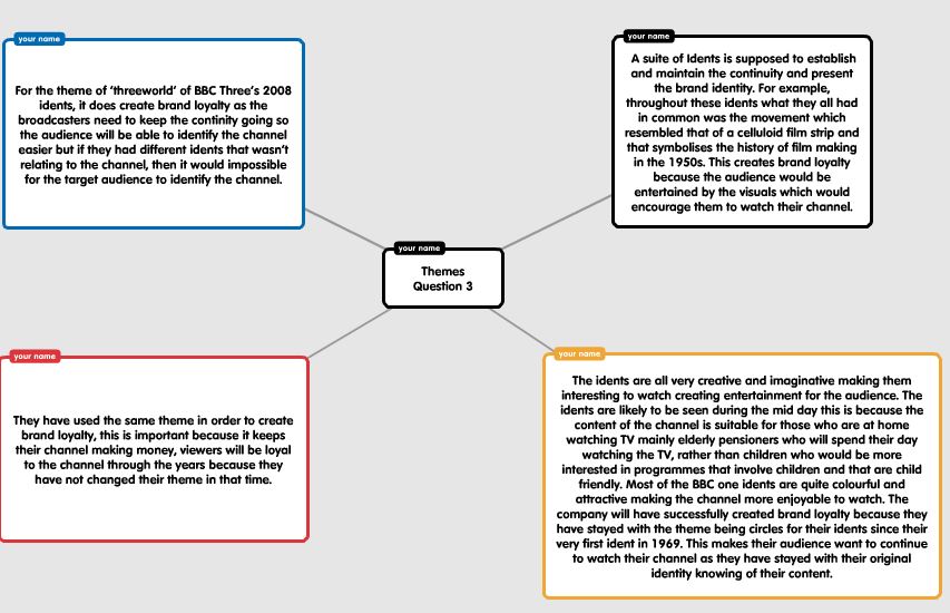
        iii. How they have used the same theme in different ways to create Brand Loyalty
       iv.  Explain whether, how and why the idents are information-led or entertainment led
        v.  Are the idents intended to be used at a particular time of day?
       vi.  Are idents intended to be used at a particular time of year?
      vii.  What does the suite convey about the channel's Brand Identity – what meaning? 

     viii.  How effective the design of the suite is in communicating Visual information to a non-visual audienceappealing to a target audience; and the audience appreciating of desired tone       ix. Assess - How effective the design of the suite is (Typography, Pace, Density of Information, Brand Identity)


Suite of Idents - Sky Sports:

i.) The theme of the suite of idents is could be interpreted as Britishness, this is because they show and portray the logo as blue, white and red, which is the same colour as the British flag, this may suggest to the audience that the channel appeal to the UK. One of the main themes used in these idents is the colour they use, with it appealing to the audience.

ii.) The theme of the suite of idents is could be interpreted as Britishness, this is because they show and portray the logo as blue, white and red, which is the same colour as the British flag, this may suggest to the audience that the channel appeal to the UK. Camaraderie and  British feel


iii.) They have used the same theme in order to create brand loyalty, this is important because it keeps their channel making money, viewers will be loyal to the channel through the years because they have not changed their theme in that time. This is important because they understand that the 

i.v.) The idents  would be more of an information led ident, this is because they advertise the sports that they show within the ident. This is because also the fact that within the ident, they have a voice over towards the end when the music concludes, the voice over mentioned where you can watch it and how long for, as they say '24 hours a day' They also mention on what you can watch it on, such as PC, tablets or on TV. They then give the name of the channel. This means that it is information led because the voice over is feeding information through to the audience watching and listening throughout, however, there are elements of entertainment led, as they show, short clips within the ident, showing the sports they show, this is done to entertain the audience too, this is because they know that people will be entertained by the ident, even though it is mainly information led.

v.) The Sky Sports News idents are not specifically used at a time of day, they do not advertise certain shows at a specific time, this is because all of their content is appropriate to view for all ages, there is no time limit for them on what they need to show and when, however, they do have a specific programme, which is titled through the night, however, the ident does not change in the visuals, but and voice over, but the typography on screen will change stating through the night, this is also being informative.

vi.) Sky Sports created an ident for the Christmas period, this is the first ident below. They created a Christmas ident because they know that it by doing a Christmas ident, it will advertise the season, this may broaden their amount of audience share for the channel, as they know that by doing a Christmas ident, more people will watch the channel. They will also advertise what they will be showing at this time, they know that people expect to see sports news for all sports on the channel, however, they just change it in a small way to suite the season and this keeps the audience share happier.

vii.) The suite of idents shows that Sky Sports brand identity is trying to get the audience to understand that they are a sports channel, sports news, directly for sports fans and all types of sport, showing that they are diverse as they speak about all sports, both more men and for women. The idents is could be interpreted as Britishness, this is because they show and portray the logo as blue, white and red, which is the same color as the British flag, this may suggest to the audience that the channel appeal to the UK.

viii.) The Sky Sports News Ident, carries out the well known conventions that an Ident is mean to show, this is because straight away before anything they introduce the music but the first thing on screen is the logo, this is also the last part of the ident on screen, to start and end with Sky Sport News, they have done this purposely because the logo is the most important part of the ident, this is because it emphasises what the identity of the channel is and what they show. This ident also includes video clips from the types of sports they show, this portrays to the audience that they appeal to all sports fans in their audience because they talk about all sports in detail, also proving they are a channel, this is because the voice over says you an access it anywhere.


Overall, the sky sports idents are successful as a suite of idents, this is because of the typography,  Density of Information, Pace and brand identity. The pace if the idents is important within the suite, this is because they are all in slow motion, by doing this, it allows the audience to feel drawn in to the ident,  the slow motion mixes well with the music in the background because they both compliment the channel as being inspirational and enjoyable like sports are seen to be and how the fans would view it. The typography is important in these idents as it appears as big and bold, standing out and colourful, the typography uses the color's of the British flag, red, blue and white. This is used to appeal to the audience who are usually a British audience, so they want them to feel welcomed in to the channel. The ident uses a small amount of density of information to convey the message to the audience, this is because they use a voice over to say the information, just notifying the audience on the channel's name, so they understand what they are watching, the voice over doesn't explain much because it is almost self explanatory. The brand identity of the channel is the personality of the channel, this means that Sky Sports has the identity of a sports a sports channel, appealing to sports fans in Britain as they use the British flag colors within the typography,  however l, they also appeal to all around the world.


3C - Typography

Wednesday 1 February 2017

Limitations and Opportunities - Task 2A and Task 2B


Opportunities: Task 2A

Branding of Content:
This is a marketing opportunity for channels to advertise a programme on their channel before it is broadcasted, this is done because it is a way to make the viewers aware of what is coming up soon, or next, almost done to give the audience a taste or a flavour of the programme that the TV channel is advertising, such as the ident below, which is the BBC 1 ident, when it is advertising Eastenders. The ident is a clip, showing characters and events that will be happening and occurring throughout the upcoming episode, making the audience look forward to the episode and this will make them watch it, however, it is manly done as a marketing technique in order to portray and to advertise the most popular programme on the channel.


Creation of co-operate identity:
This is important as the ident will show the aims of the channel to the audience, this will make it clear to their audience and viewers as to what there channel is about and what their image is for the audience to understand and possibly connect with. The BBC 1 ident from 1955 uses the same logo within it as it does now, using the circles as a symbol of the world, this shows to the audience that they are all together and even though the BBC is a British channel, they are symbolising that the world are welcome and everyone is together within the BBC.


Creation of tone:
The creation of tone is the feel of the ident to the audience, so the audience get an idea for what the channel is saying to them and how they feel about the channel. The ident they create can feel nostalgic for the audience, such as the channel 4 ident, they make the audience feel a sense of nostalgia because that was the first ident that was create in 1982 for channel 4.


Appealing to target audience:
This is how to appeal to the audience, meaning that the ident may focus or specialise on a specific topic, such as the BBC 1 re-brand, this shows within the ident the dancers, are older, meaning that the ident is specifically targeted at the older audience, almost so they show brand loyalty, as they have been loyal to the channel and have watched BBC 1 most of their lives, the BBC 1 ident is almost giving something back to the audience, this appeals to them because of the logo also as it says 1ness, meaning togetherness, appealing to the audience because BBC in this ident are saying that we are all 1 and al together.


Encouragement of brand loyalty:
Encouraging brand loyalty is important for channels as it keeps their usually consumers are viewers loyal to the channel, a channel such as the BBC will create brand loyalty in their ident of the hippos, as they continuously use the circles as part of their brand identity, it keeps the audience loyal to watch it, making them feel safe and happy with the BBC, as the circles represent the world and a symbol of togetherness.


.


Limitations: Task 2B


Color:
Each channel has a different colour so their audience can identify with the channel, there are certain colours that cannot be used because they may not be broadcast safe, colours such as red, green and blue are all examples of broadcast safe colours. Some colours are associated with certain channels, such as red with the BBC, meaning that other channels can't use this colour red in the same or similar way because it is associated with the BBC and if anything, that channel with only be advertising the BBC by mistake. The ident below is from MTV, meaning that the ident can be seen as a limitation for idents, this is because they use possibly too many colours, when there is only a certain set of colours for the broadcast safe.


Typography:
With many idents, the typography is extremely important and must be correct, it is not just about text, but it is also about the layout of text, along with the font style, the could be using numeration on a radio station, however on a TV station, text is used.  This ident for ITV can be because the logo is not in the middle of the page so it is not obviously standing out straight away, also because the bubbles on screen cover it for a while. The typography


Size:
This is when the audience view the ident through different views, such as on TV, online on a computer or on a phone, it can be a limitation because when making the ident, you have to size the ident to fit all screen, large and smaller. This is too big in the channel 5 ident. The issue with certain idents that have the wrong size with their logos is that is is more difficult for the audience to see and understand, this is why size is a limitation. The size must fit to all screens that are available, this is so all members of the audience are able to watch it, this is mainly the reason because not many people compared to what they use to, watch television as much now, meaning that a large number of the audience all will watch  it on their phones, meaning that the aspect ratio must be the right size, or it will be unclear for the audience.


Aspect Ratio:
This can be a limitation because the aspect ratio for television in 16:9, 4:3 or for cinema, 21:9, this means that anything that is filmed for TV that is not within these aspect ratios, the image or footage on screen is then likely to stretch out and show black bars along the screen. I have chosen the sky sports ident as it shows the logo on screen in the middle of the page, however, when this ident is watched and seen on mobile devices, sometimes the picture and image looks stretched out. The size must fit to all screens that are available, this is so all members of the audience are able to watch it, this is mainly the reason because not many people compared to what they use to, watch television as much now, meaning that a large number of the audience all will watch  it on their phones, meaning that the aspect ratio must be the right size, or it will be unclear for the audience.


Resolution:
This is whether the ident is clear or not for the audience, if it is not clear, it can be seen by the audience as it could be seen in a distorted or pixelated way, there are 720 pixels for HD, 180, for 4HD, these are the two standard pixels, when you zoom in, you can see the footage or image pixelate on screen, as you start to see all of the smaller squares on screen within the footage or image.


.